


What was given as a test for a UI position, I had to redesign the main menu with any style sensibility, so long as key menu items were present, the new menu flowed with respect to the player's needs, and had a wide appeal.
First step was researching the game itself (screenshots, etc. copyright Scopely). Design-wise, it felt that the menu items for the store, facebook, and such were scattered, and visually not as cohesive as I would have liked.
Second was sketching and note taking. Trying to break down what I felt was important to the developer to communicate to the player, and what was important to the players themselves. Additionally, first ideas for new icons, etc. It felt like a good chance to use my illustration background to make icons that were stylistically cohesive between each other.
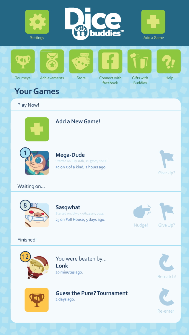
Finally, the 'new' menu. I went for a less-is-more approach lending larger images to carry the menu buttons, with text underneath. Also, choosing softer tones for icons (rematch, nudge, give up) that may have otherwise felt like a cluttering of the screen space.
Most importantly, I felt it was necessary to put all options at the top and easy for a player to find. A universal look was made so they would all feel part of the same menu. This freed up the activity feeds to be one continuous stream of information, than broken up.
While only a test and nothing official, I felt that it was a good exercise in design and something worth sharing!